Here are 10 Blender renders that I created using textures from Poliigon.com, website with awesome CG materials and other stuff. You might have seen some of them, but not all of them I guess. So here we go!
Software: Blender, Cycles, Krita, Gimp
Production time: 7 days each render
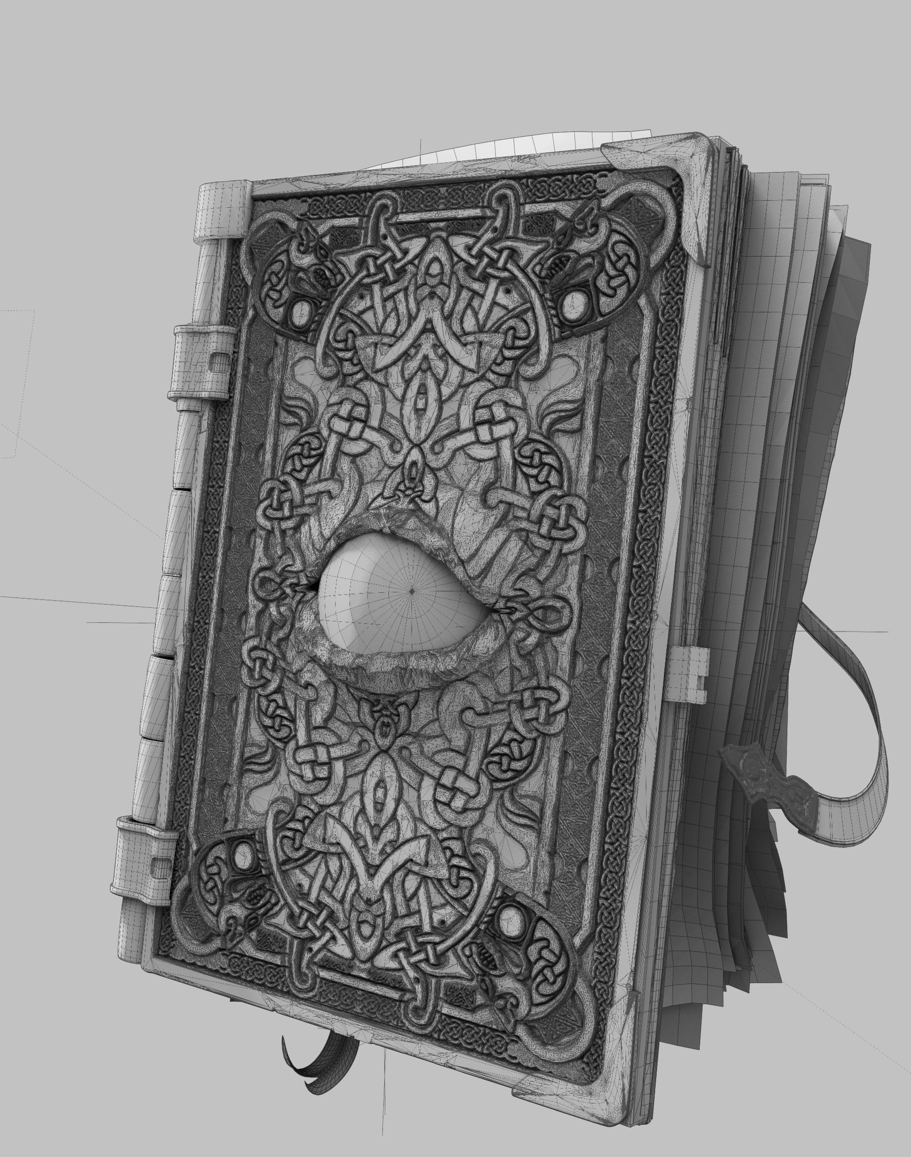
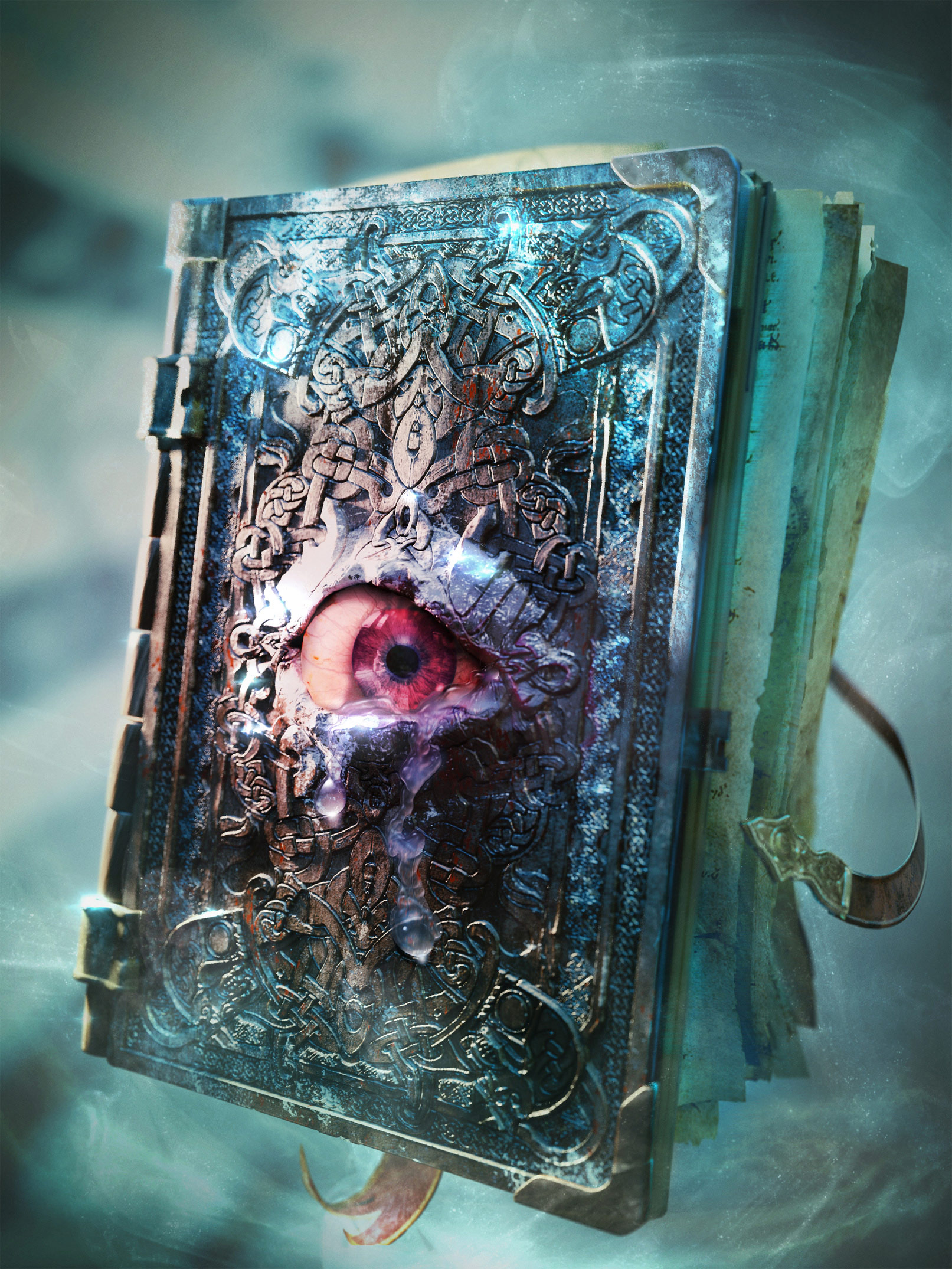
1. Magical Books (And Where to Find Them)
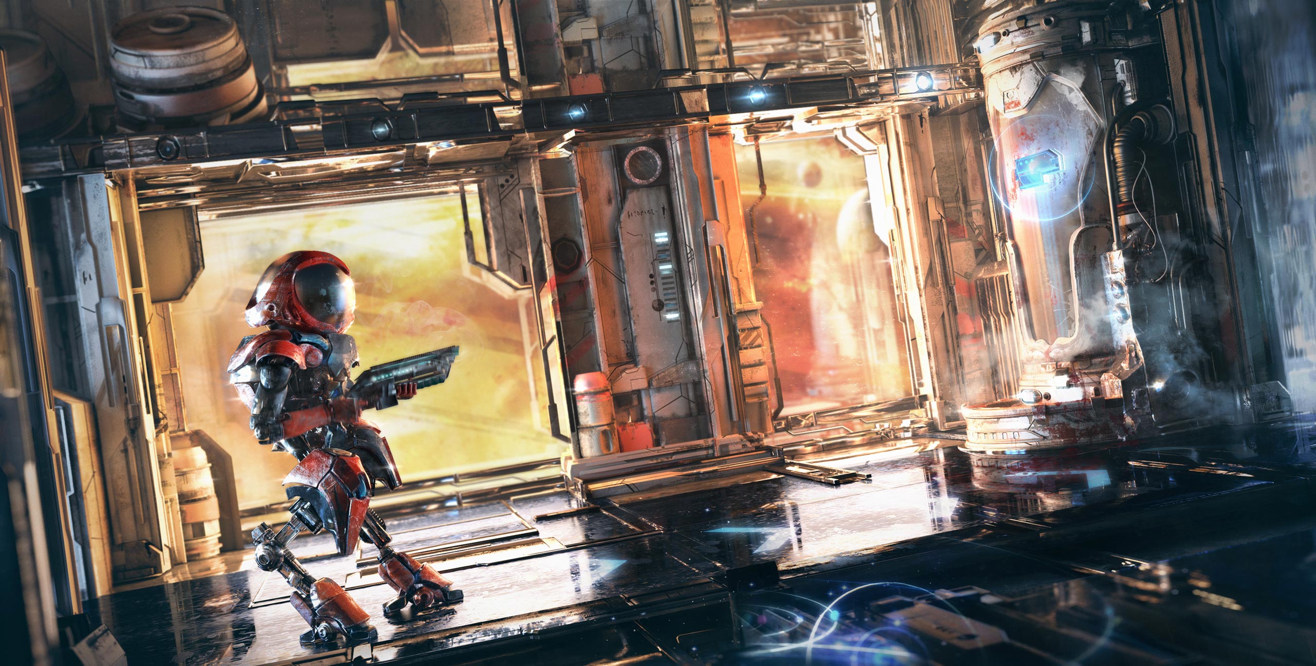
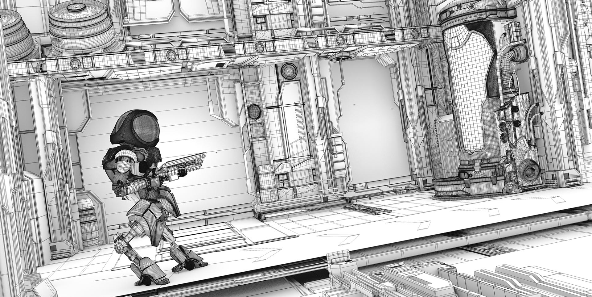
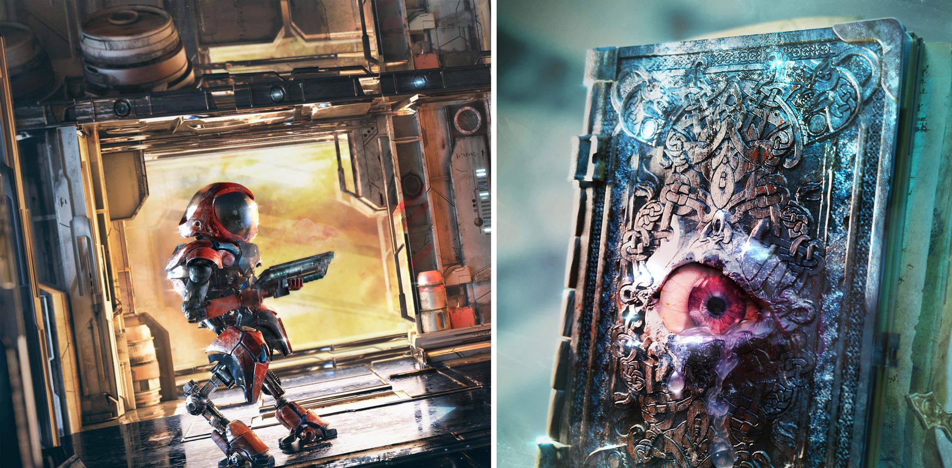
2. Sci-fi Game Concept Art (in Blender)
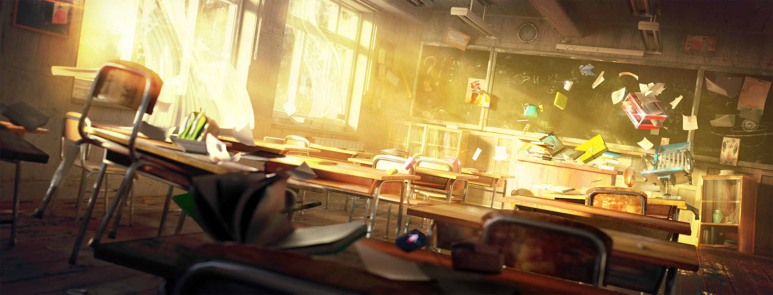
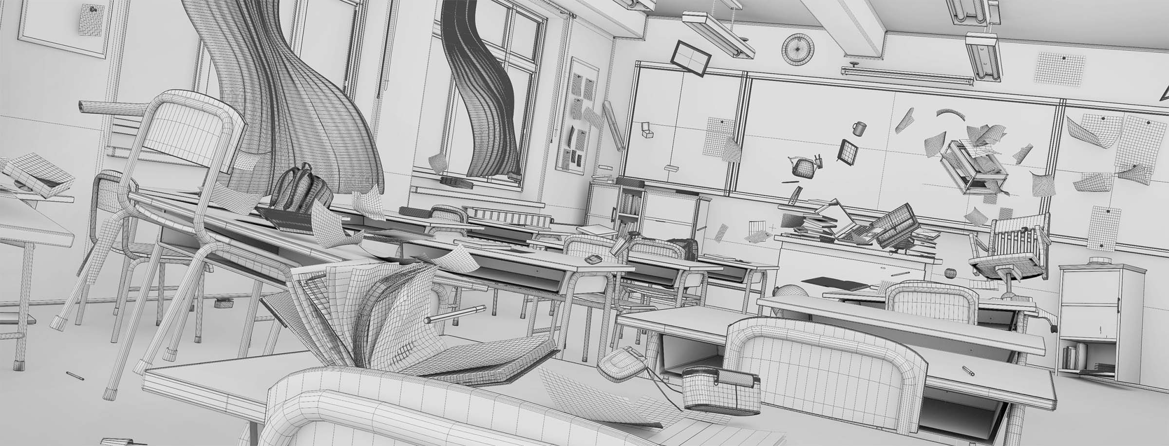
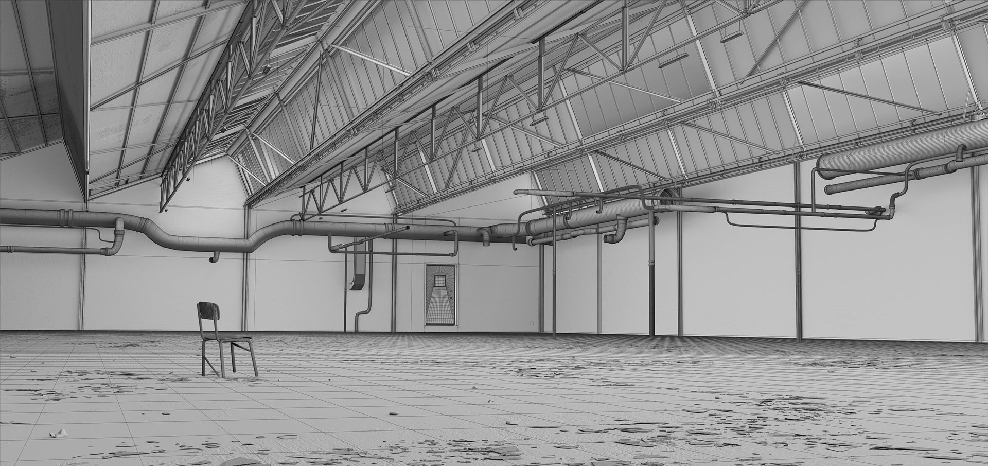
3. The Classroom Environment
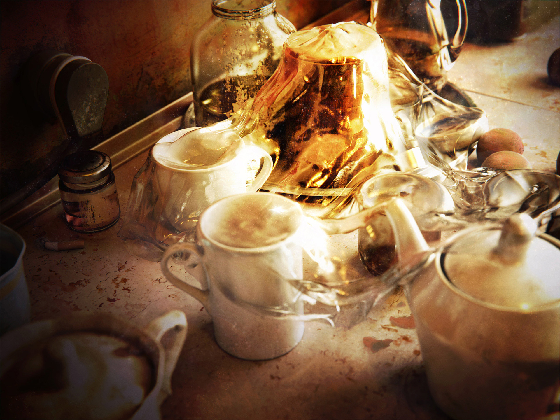
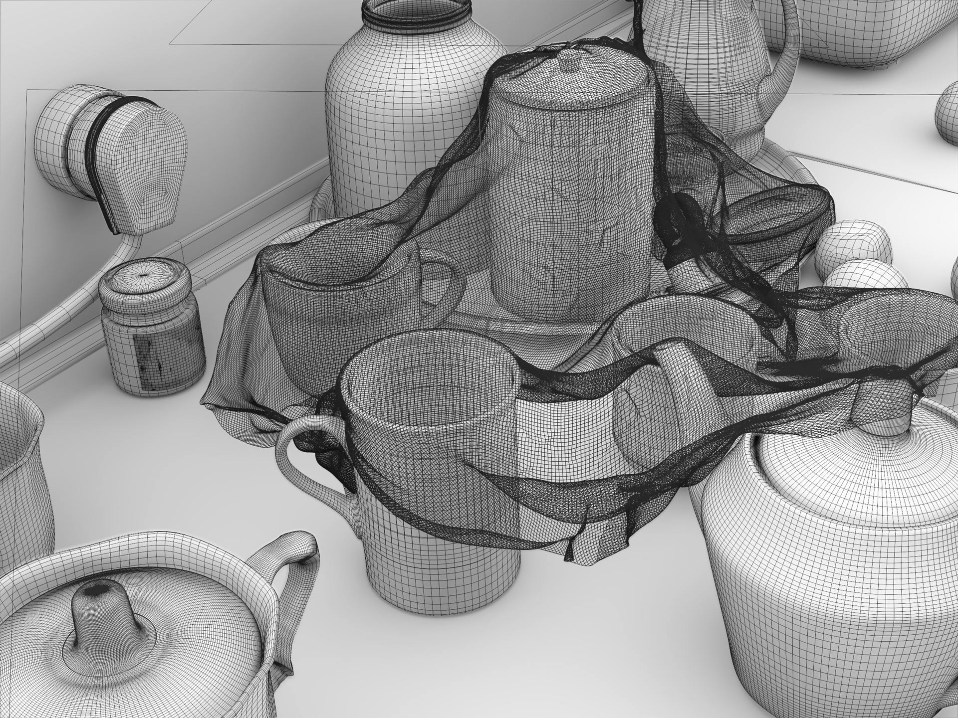
4. Kitchen – Still Life
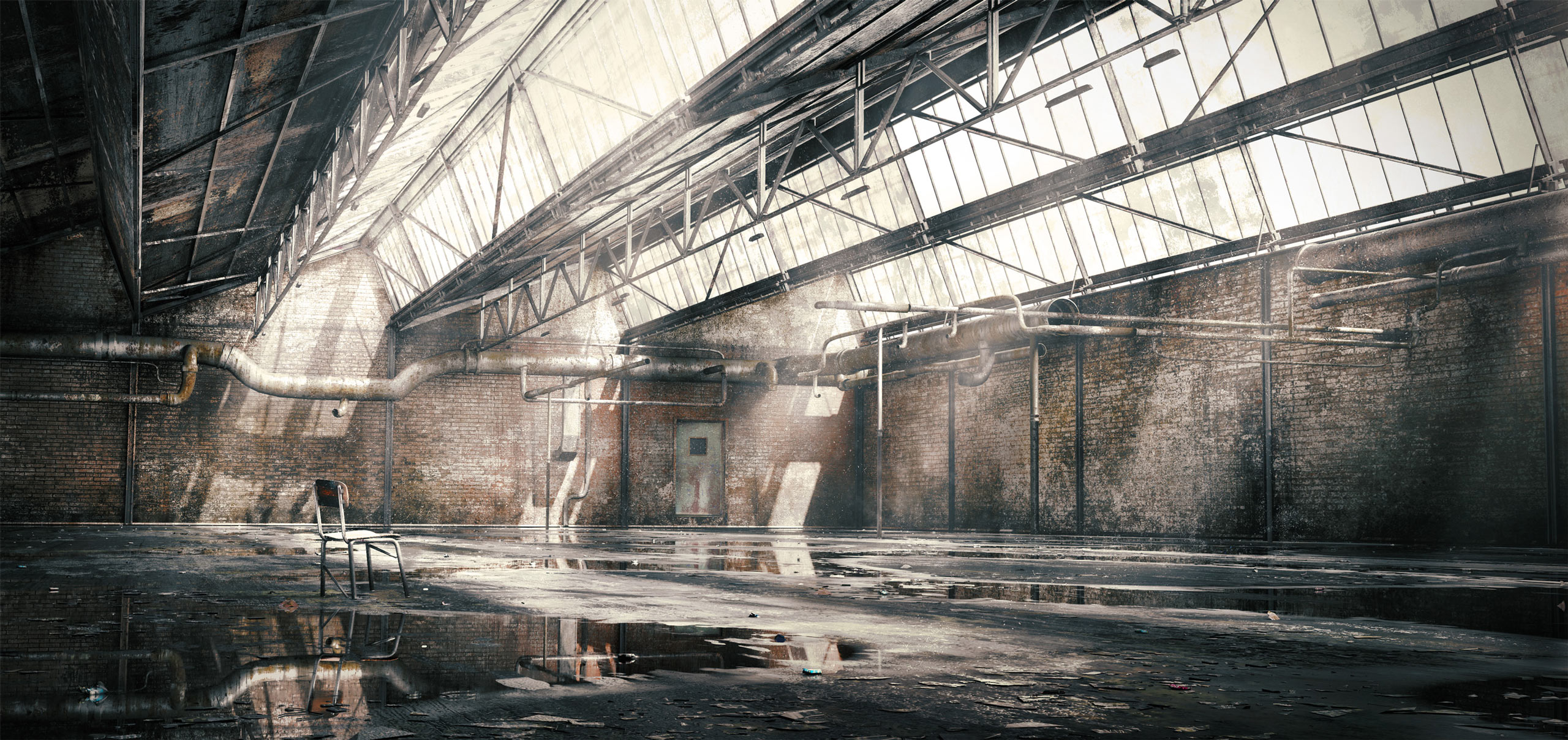
5. Grungy Environment
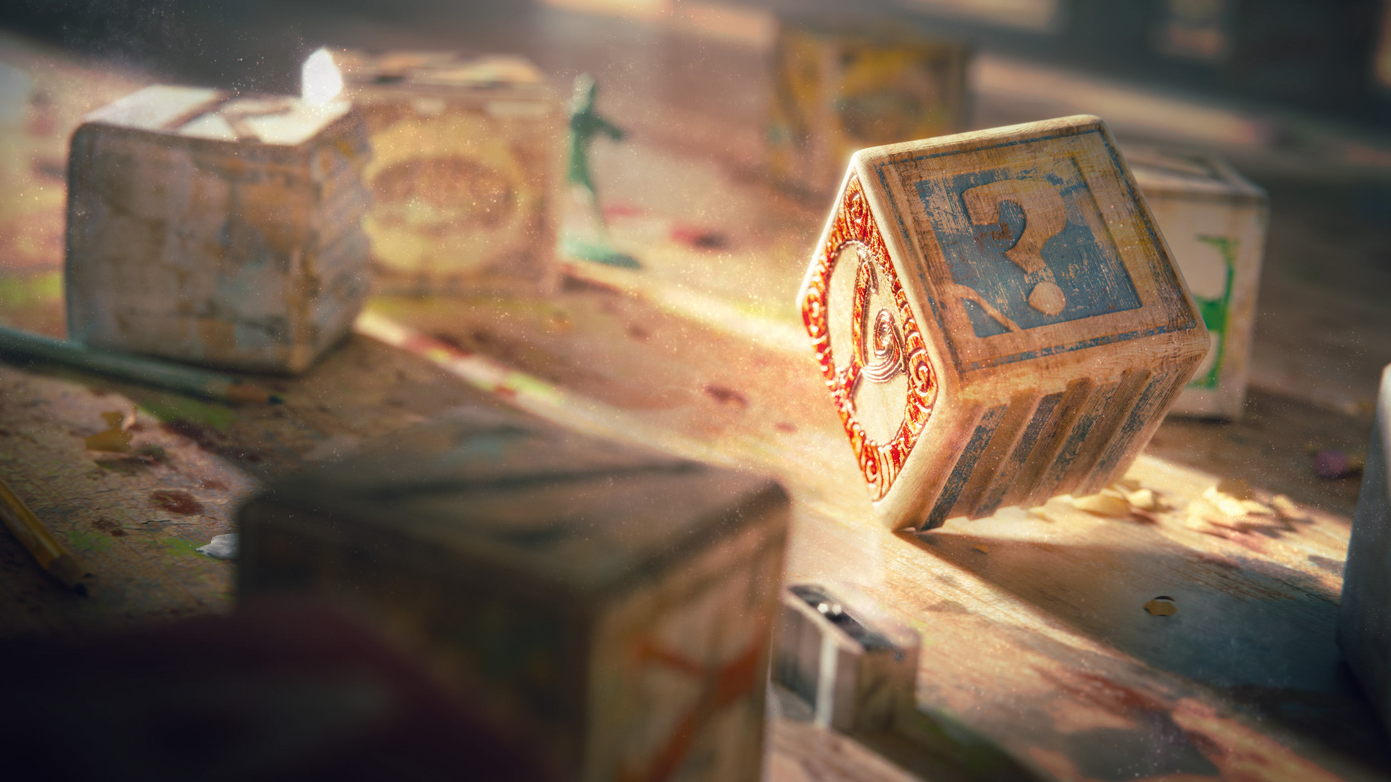
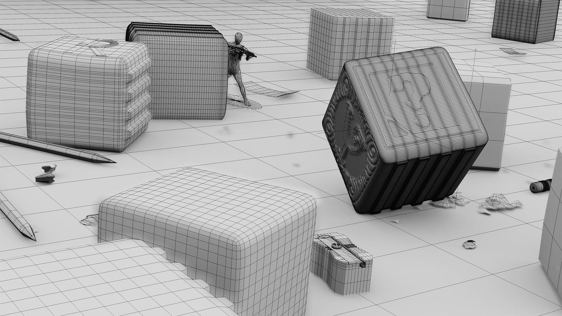
6. The Letter Blocks – Textures and Lighting
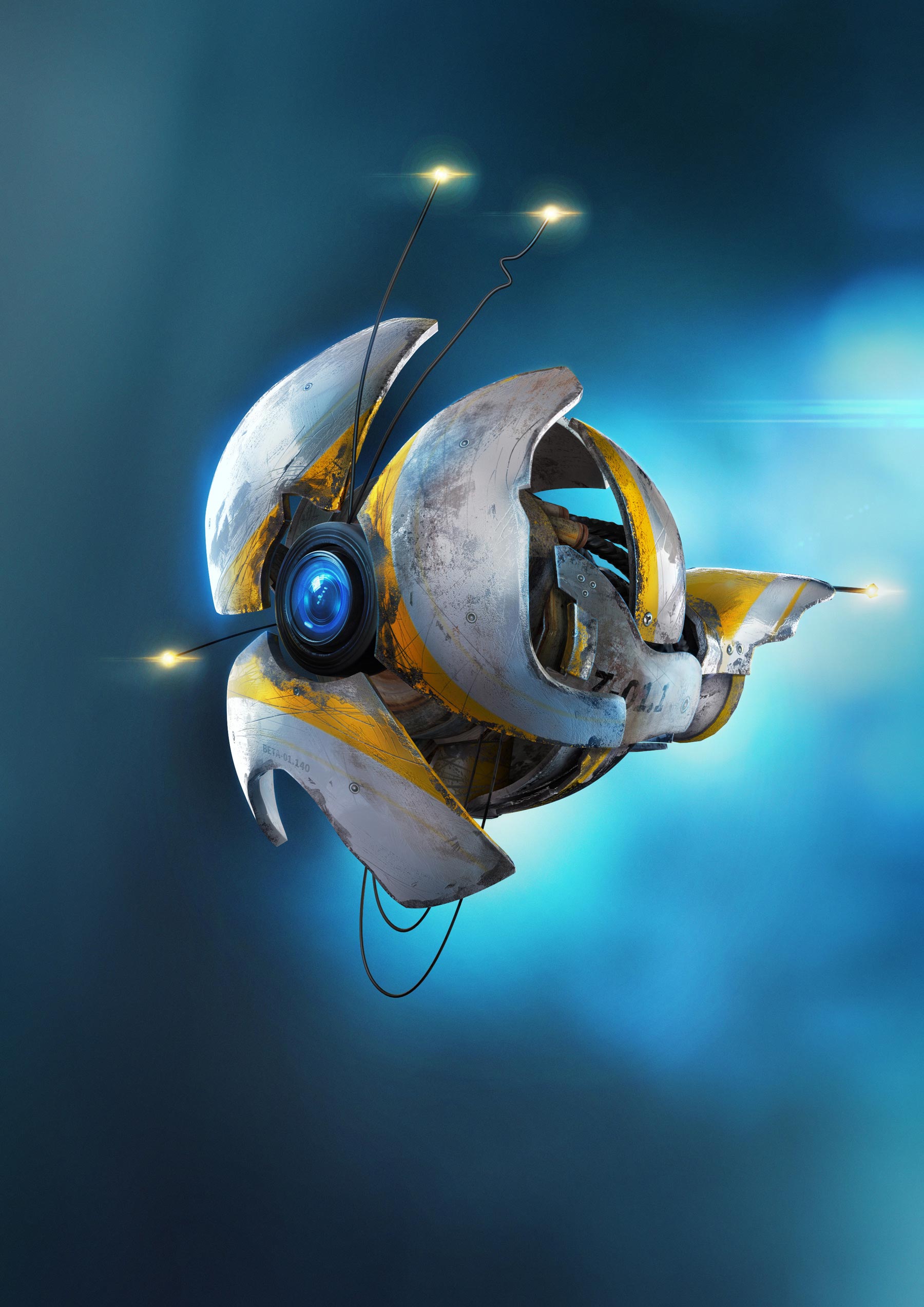
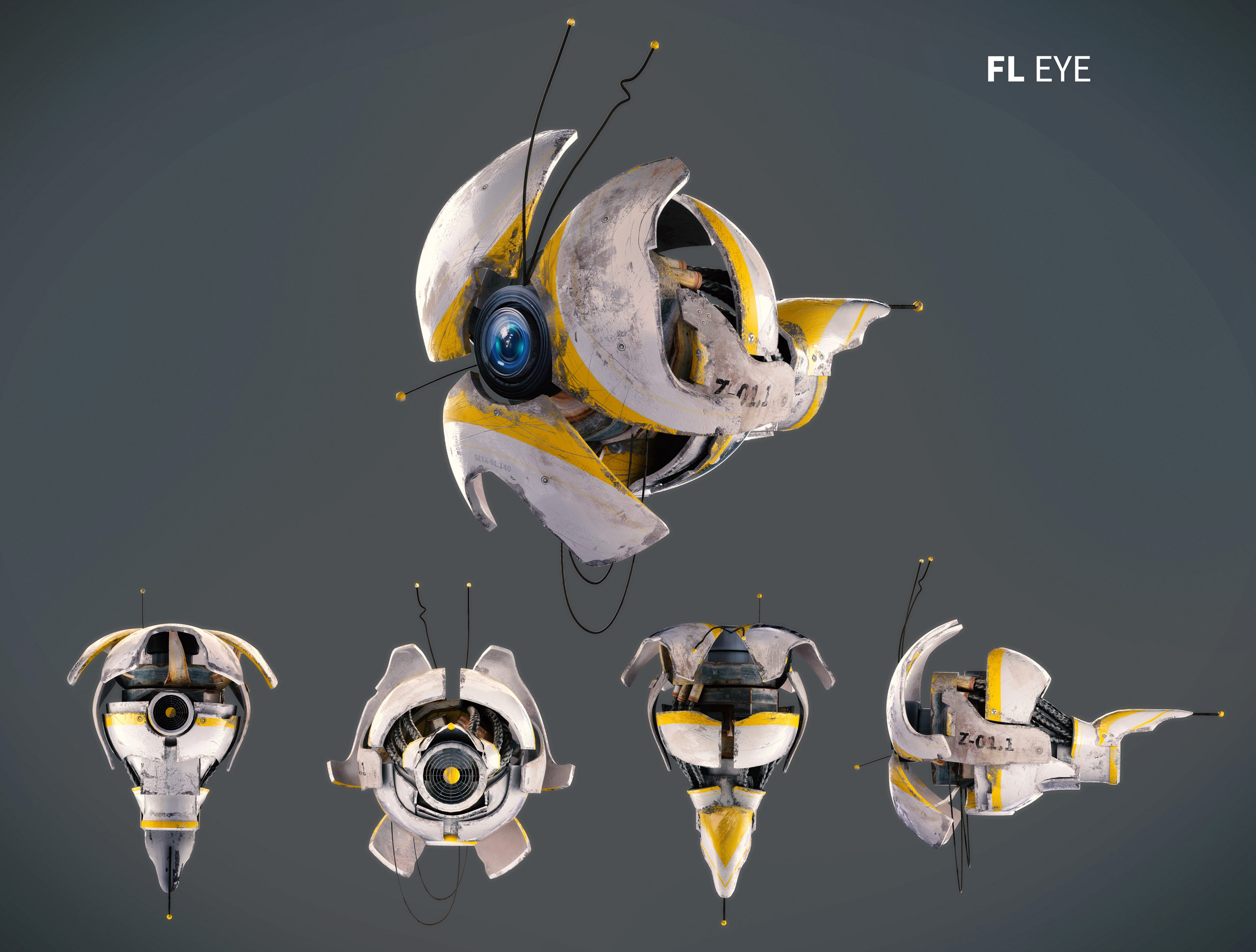
7. A Drone Concept (FL Eye)
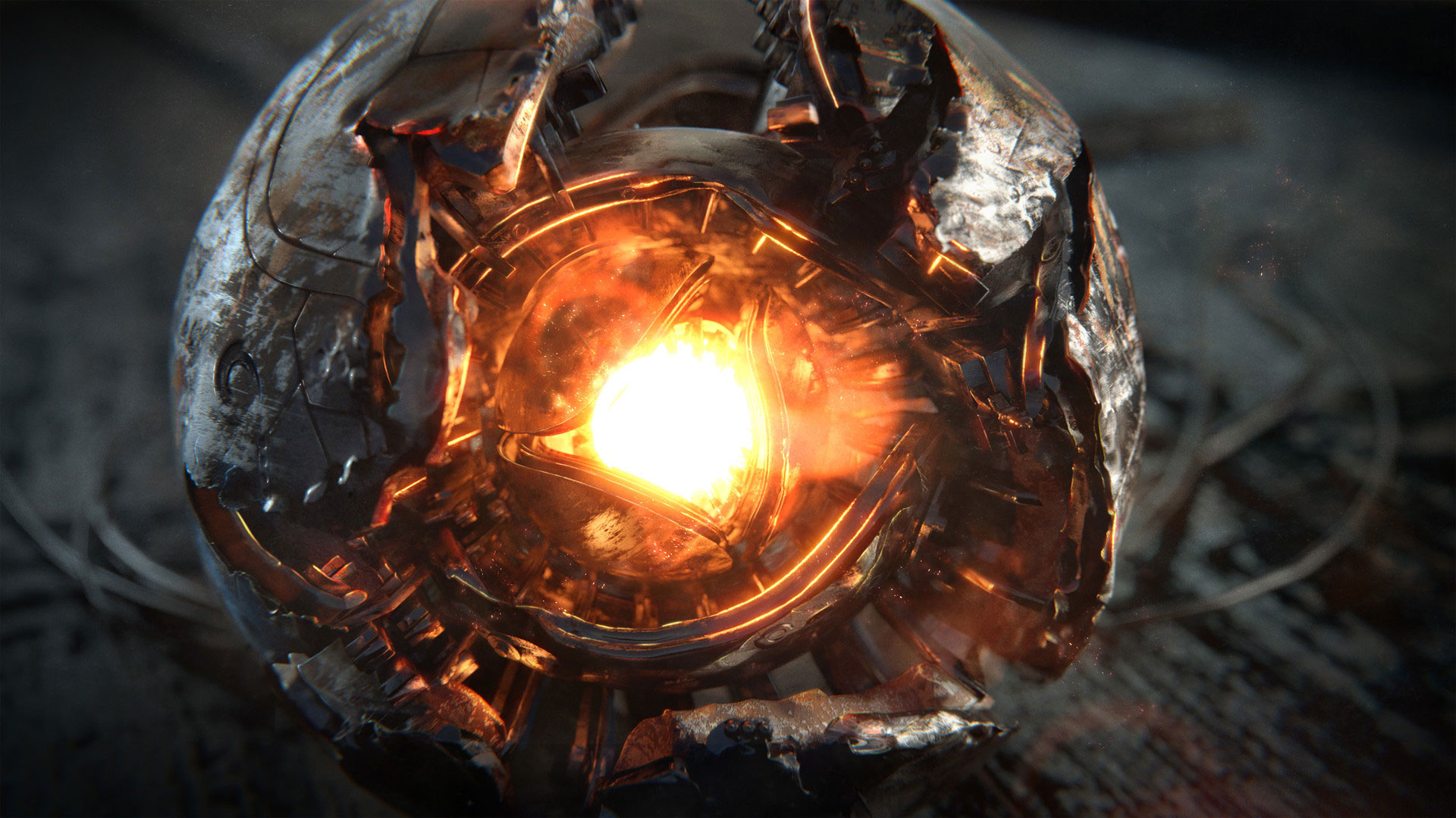
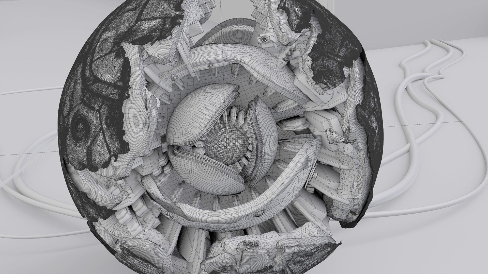
8. Eye of Destruction
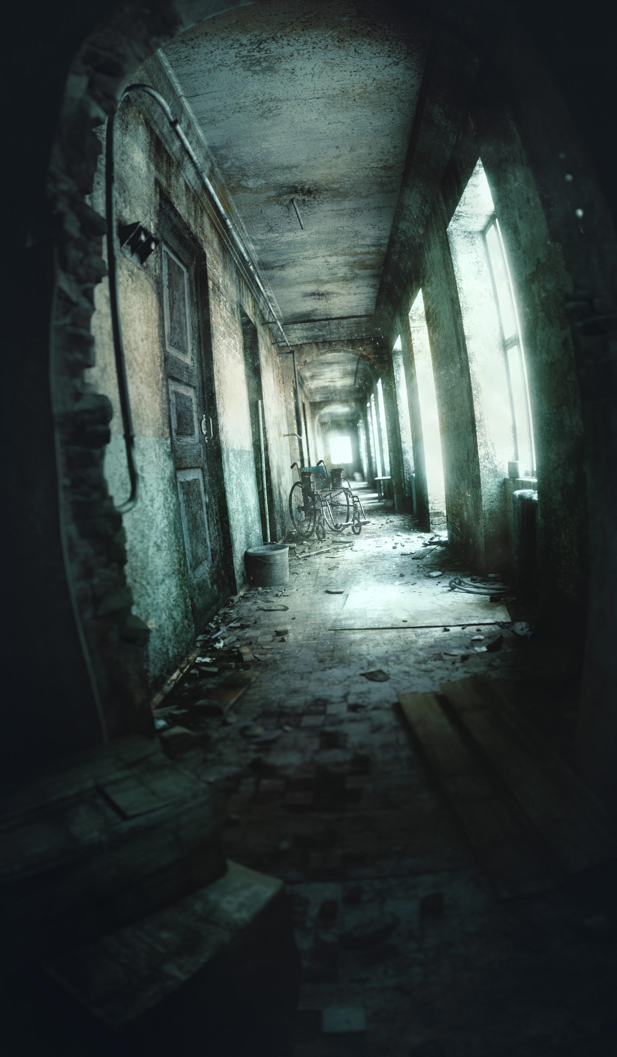
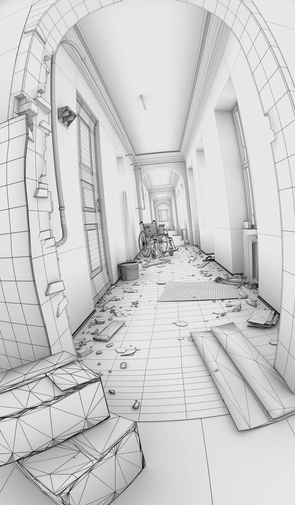
9. The Hallway
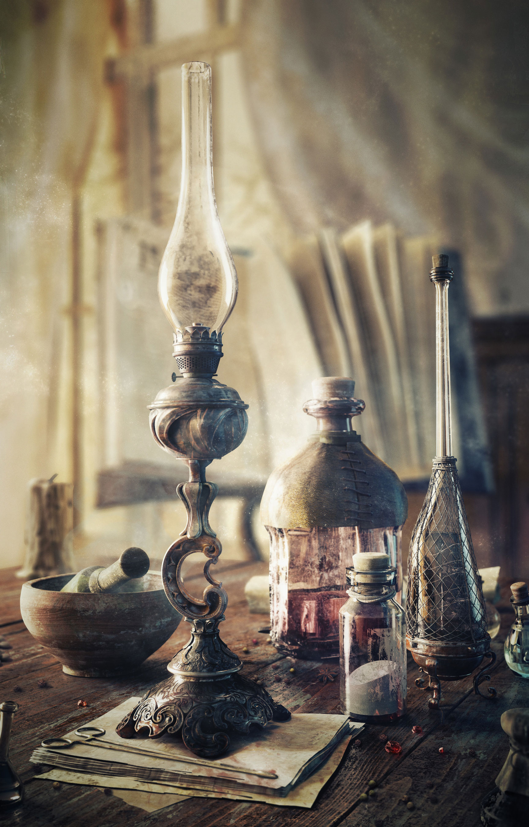
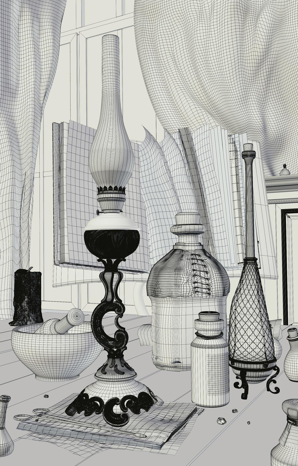
10. Alchemy – Textures and Lighting
What’s your favorite Blender render? Let me know in the comments below.



Abraham Mast
Always amazing 😉
Gleb Alexandrov
Thnx ;))
Giacomo Alberini
I think that Grungy Environment is by far my favorite. It would be nice (for me at least) to try to composite some footage into it in order to see wheater it would be believable as a CGI background. Maybe I’ll try it, when I’ll be able enough to use this wonderful tool which is Blender, of course 🙂
Simon Franz
Fantastic Work! My favourite is the hallway.
Александр Гутан
Very beautiful works! Thank you!
Alison Garnham
I have 3 favourites: Magical Books, the Eye of Destruction and The Hallway (closely followed by Alchemy).
thurlough
Definitely Eye of Destruction followed by Alchemy. Though I’m curious as to how you made the wireframe render? The wireframe shader node just converts everything to triangles…
Gleb Alexandrov
As far as I remember I composed wireframe render from two kind of passes: the first one was ambient occlusion and the second one was the Blender viewport with the grey material and ‘wire over mesh’ enabled for all objects.
John Cardozo
Awesome! I wouldn’t know where to start to achieve such amazing work like these. You rock, man!!!
Gleb Alexandrov
Thanks John. Start with a single step, something easy to do. Say, find a reference photo of a cool thing and model it 🙂 Something like that.
John Cardozo
Thanks a lot for your reply. I’ve been working in Blender for several years and I could say that some people just have the natural skills to achieve this kind of work, Of course, you could get these skills practicing a lot, reading, trying to get results of top artists in the community (like you), etc but “It’s a long way to the top If you wanna rock ‘n’ roll”…
Daniel Duplain
3. The Classroom Environment, super travail!
Gleb Alexandrov
Thanks!
bigstoater
The hallway is my favourite, love the wide angle lens distortion.
Gleb Alexandrov
It resonates with me too somehow.
Russ
Love the hallway , is that an import from a different mesh format? Just curious why the crazy topology? Are you modeling into the textures after they’re applied? Either way it’s impressive what a good texture / shading job can do to a very simple model!
Gleb Alexandrov
Russ, it’s a good old standard poly modeling, nothing too fancy. If anything looks weird, it’s because I messed up the topology ))
John Cardozo
unsuscribe
Gareth
These are incredible! Tutorials please 🙂
Todd MacLean
Eye of Destruction!!!!!!!!!!
Gleb Alexandrov
Epic title, huh?)
Saki Dezin
Marvelous, you are becoming the inspiration. I am anxiously waiting for some animations and product design galleries like in commercials from your side.
Gleb Alexandrov
Saki thanks a lot!
Canadian Geek
Gleb master, let me be your padawan!!
Gleb Alexandrov
The Force is inside you, find it you have to.
Nikola Tesla
Really wow
Michiel Coene
Why does some geometry seem so messy ( for lack of a better word )? Like the objects on the foreground (bottom left) in the hallway? Is that because it’s photoscanned, or decimated? What’s up with that?
Peter Kryszkiewicz
The pure monochrome face representations show awareness of good composition. But once you add textures and lighting – Yechh! They’re all ugly, especially the Magical Books. Looks like a dog’s breakfast. You need to study a little more Fine Arts basic theory.
James Elvis
Splendid work Gleb!
Jadon
I noticed that in the first one (Magic Books) the water drops coming from the book’s eye aren’t in the mesh view. Did you add those on after?
Abhijith S Nath
Incredible as always!
SergeRamelli
I would totally buy a tutorial on how you do that, you have been by far the 3D artist that inspires me the most!
Ratheesh Kumar
I like the way you add the magic elements and a story in your renders, Keep Rocking.
Taffi Tasteless
mindblowing- each of them!
Paweł
I love the first image: Magical Book (or rather a good version of Necronomicon ;). Look at the cover: tears from the eye, blood doplets, rust, probably some frost. Really impressive.
Daddios
I like all of them but my favorite is the Alchemy, I like mystical environments which make you think what might be going on. I like the fact you presented the wireframe images as it gives budding modelers some idea of the item’s complexity.
bdiscus
My favorite is definitely the grungy warehouse, like it came straight out of some big hollywood studio, so spot on Gleb 😀
Nicolás Ramírez
I would buy a tutorial on any of them immediately…
João Paulo Ribeiro
Incredible renders! Very nice, Gleb! But I think you made an error in the 4th render name. This’s the same name of the 6th render name. Are you sure? 😀
Gleb Alexandrov
Of course! Thanks for pointing this error out to me. Fixed.
João Paulo Ribeiro
You’re welcome! 🙂
I would like enjoy this opportunity to ask how can I make this “mesh render” like you did?
Xakkar
I would buy a tutorial just to watch you create these! Freaking awesome work
eknightGER
Hi Gleb, great stuff (but we expect nothing less, so that is the drawback of continuous excitement we derive from your work) – couple of questions: Did you use photogrammetry (and retopology) or, if not, how long did the modelling take you? Also, solely blender for compositing or did you use something like Photoshop / Krita as well?
Pingback: Kitchen Blender – ide dapur sederhana
Pingback: Kitchen Blender – My Blog
Pingback: Kitchen Art – My Blog
Pingback: Kitchen Designer Easy – medicalplaza
Pingback: Kitchen Interior Design 2018 | Variant Living
Pingback: Kitchen Design Software 3d | Amazing Home Design