Interpreting the lighting in a crowded city is like interpreting Kentucky Derby (by making notes in your notebook). You know, decadent and depraved things demand some caffeine at least.
Sometimes you need to stop interpretation.
How are you going to analyze the lighting in a shopping mall? The shitload of advertisements on Beijing street? The mass production of visual media in New York?
Bam!
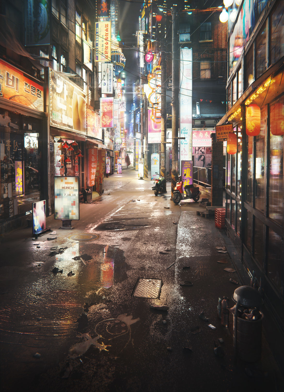
The world of hyper consumption exploded with shining, strobing and flashing stuff. And you are still holding your manual with lighting schemes: Rembrandt, loop, butterfly.
You get lost in things that don’t really matter.
To create an image like that you need to think differently.
Why?
You can’t interpret this Blade Runner-esque scene in terms of lighting schemes. No lighting technique from photography book is able to describe this weird aesthetic experience.
So what can you do?
As Susan Sontag noted: “In place of a hermeneutics we need an erotics of art.”
It’s time to recover your senses. I would even say that it’s time to overstimulate your senses!
To create a really immersive urban experience you need to feel something about it. You need to really see it. You need to immerse yourself into that experience.
Lighting Tutorial: Quick guide to Visual Overstimulation
In this lighting tutorial we’re going to create a crowded city illumination. Follow through these 3 steps and you will end up with having a cool lighting in your artwork.
By the way, if you want to create a nature render instead, check Pro-Lighting: Skies HDRi pack by Blenderguru.
Step 1. Start by Drinking a Double Espresso
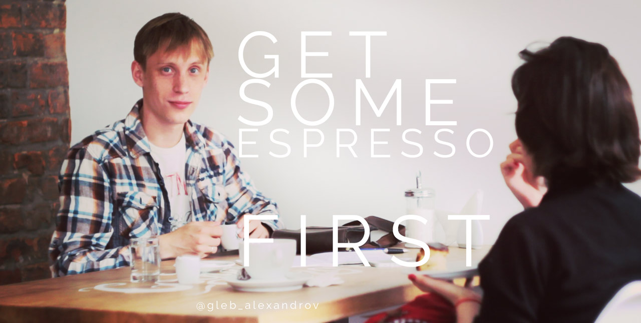
Start by going for a walk and ordering a double espresso in the nearest Starbucks or whatever.
Double espresso provides just enough stimulation to feel the vibe of a big city.
Your growth as an artist is a growth towards drinking more coffee.
But be careful, because “Ongoing sensory overload can lead to depression, fatique, hopelessness, and, in some cases, suicidal ideation.”
Step 2. Ask Yourself What Do You Really See, When You Look at New York?
Browse through the references of crowded urban environments on Flickr or Pixabay.
Ask yourself, what do you really see?
And when I’m asking his question, I don’t necessarily mean the content of the picture. Look at form, look at lighting.
Erotics, not hermeneutics.
Here is my list of things:
• LSD trip of visiting a huge mall
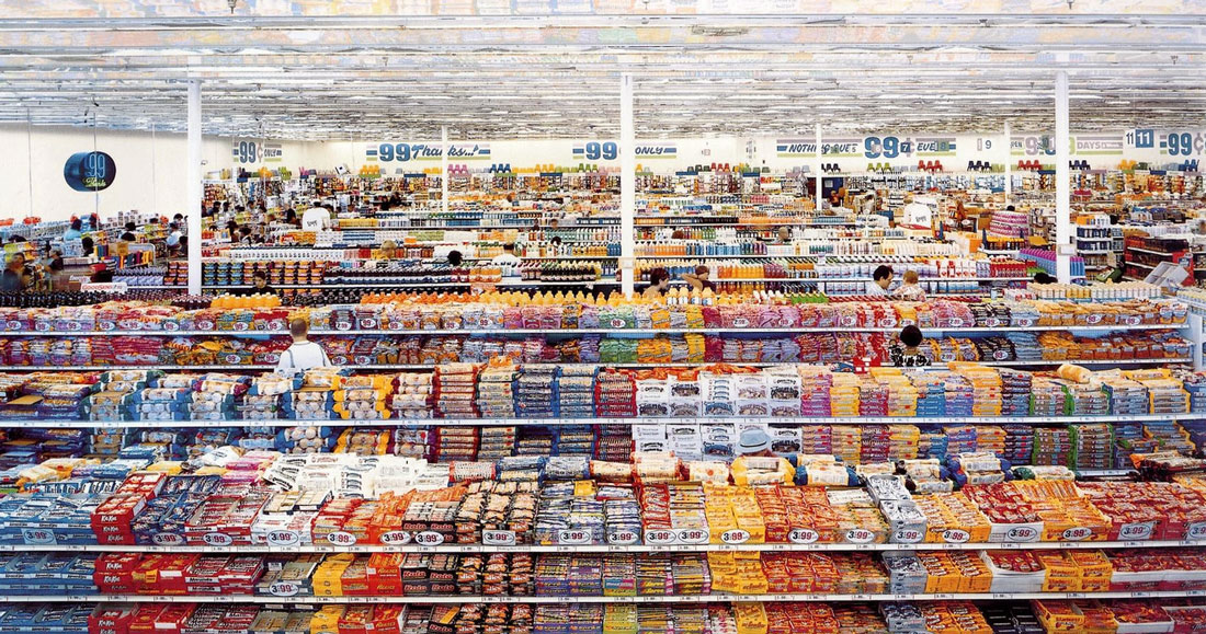
Once I stumbled across the article on Mental health talk website, where Trish described her overstimulation while visiting a mall. She said it was like taking LSD.
“Then my visual perception would shift and it was like everything within my visual range was reaching toward me.”
Indeed, all that advertising in a big city reaches to you, speaks to you directly. Can you see it?
• Overstimulation
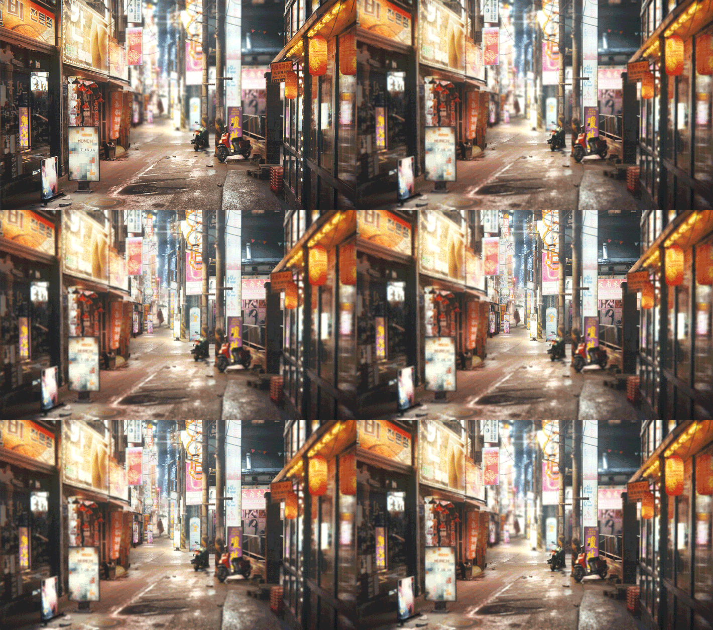
Look at the crazy amount of light sources in the image.
It renders obsolete such things as the angle and the softness of the light. Who cares about the angle, when the light spills from all angles?
It’s a sheer overstimulation.
It’s a total eyef#ck.
Step 3. Now Overstimulate Our Eyes
Maybe you experienced that anxiety of sensory overload, like Trish did. Maybe you experienced your own thing (Duke Nukem first level, anybody?). Or maybe you found such a great reference, that it made you want to watch Blade Runner for the second time.
Stick to that aesthetic experience. Stick to that thing that appeared to you.
Now when you have seen something, you can start creating.
Time to rock! Turn on the Wasteland 2 soundtrack and start creating the lighting in your scene.
Add that big city lights everywhere.
Make me feel like an Englishman in New York.
Continue adding lights till you irritate everybody, including yourself. But no matter what you do, stick to that initial feeling.
Spread the Word About the Open Lighting Project
If you enjoyed this article, please share it by clicking the share buttons above (and below!). It helps me tremendously to promote the Open Lighting Project.
I appreciate every share and comment and together we’ll create a really outstanding book, I promise. You are amazing.



Eden S.-G.
Very cool!
Gleb Alexandrov
Thanks, mate!
Daniel Campos Guevara
haha you always with the coffe!
Gleb Alexandrov
Heh)
Reynante M. Martinez
This is another gem from you, Gleb. It’s a total eyef#ck indeed. 😀
Gleb Alexandrov
It’s pleasure to hear it from you, Reyn. By the way, I love your latest Tree of Life artwork. Colors and harmonious composition just rock.
http://www.reynantemartinez.com/tree-of-life
Uncle Snail
I love the new image (and tutorial to accompany it). 🙂 That gif you made out of it was very sensory overloading! My eyes started going out of focus. 😛
Gleb Alexandrov
Yeah, that’s a bit of eyef#ck with depth of field. Glad you like the image! It took me a few weeks to make it.
Stepan Komisov
Очень хорошая работа! такой вопрос я так понял ты не используешь translucent shader чтобы избежать лишнего шума? Я верно заметил или все таки он есть у рекламных щитов?
Gleb Alexandrov
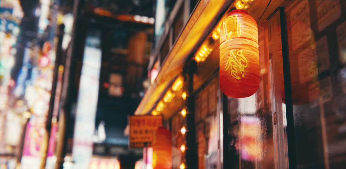
Thnx, Stepan. Indeed, I almost didn’t use the translucent shader. The only things with the translucent material are the Chinese lanterns to the right. And the red shopping carts. Everything else that shines is Emissive+Glossy.
Stepan Komisov
Thx for the answer! Realy like u works!
kropaman2
Awesomeness!
PS! Is it Andrew down the street?xD
Brian Ericson
Hi Gleb, have you thought about providing a small scene for people to try out and share the results of your lighting tutorials?
Alex Kelly
I dont know what you are saying or how you made it but the image rocks!
michael acheampong
Yea me too.
tomas pereira
haahha the sensory overload of that first duke nukem level, i could not play it. Turning the lights off fore some doom action instead. Awsome image follow all your posts through blendernation.
Niranjan Raghu
This is easily one of the best tutorials I’ve ever read! I’d love to buy the whole book if and when you publish it.
Also, art prints. 😉
Gleb Alexandrov
Niranjan, I will publish the book no matter what 🙂 That’s my ultimate goal.
And regarding art prints, I think it would be cool to start with the Zeppelins poster. Right now I’m making sort of ‘extended edition’ to make it look awesome at a big poster sizes – A3 and A2. Exciting things ahead 😛
Niranjan Raghu
Great news all around, then! =)
Jean-Marc
How about watching Blade Runner for the 20th time? And the blu-ray edition with most thorough making-of I have ever seen.
Gleb Alexandrov
Oh, I haven’t seen it! But now I want to.
Venomous TBag
I love the energy in your articles and tutorials, man, and I love the fact you are as big a coffee monster as I am! I definitely enjoy my coffee more while reading / watching one of your articles. Amazing artwork btw. I want this on my wall.
Gleb Alexandrov
Coffee monsters will change the industry eventually, that’s for sure. And yeah, we think in similar way: I just thought of creating and selling a posters through Redbubble or Zazzle. Zeppelins and this image and some other images, I think, are an ok candidates for hanging on the wall. What do you think?
CrazyEngine
so goddamn impressing, again! youre still a f*cking genius :O
Gleb Alexandrov
Hehe, you’re too kind 🙂 Just a caffeinated nerd.
Uncle Snail
Quick question. How long did it take to render, and how many samples? With that many lights (and that much reflection) it seems like it would be really noisy. Do you have any tips for reducing this noise? Thanks.
Lcq92
Oh Gleb you’ve done it again! You just come here and deliver us THIS IMAGE!
I want to go stand on every point of that road, and explore with my eyes :-]
And, you know, the best practical way to do that would be to frame this image on my wall! You’ve got to make it happen very soon, like that everyone will be able to take a break and exploooore that street, hehe 🙂
( also, where did you get all these textures? :O )
Gleb Alexandrov
I appreciate your interest, mate! I’ll let you know when the posters will be available, I promise 🙂
Regarding textures, it’s a mix of CgTextures, Pixabay and custom made stuff.
AlexanderKasper
I don’t think I understand what I just read…..but holy f*** that image is amazing! Maybe I should start drinking tons of coffee…
Gleb Alexandrov
The main point is that erotics > hermeneutics. In another words, look and feel rather than interpret. So you’re on the right track 🙂 Thanks Alexander!
Jimmie L Simpson
Sweet image! This scene reminds me of “Sleeping Dogs” so much.
Gleb Alexandrov
Yeah! Jimmie, I haven’t noticed it before, but now I find that it indeed reminds of SD.
Will Elias Tejeda
Very curious as to how you actually made this, looks great!
Anderson Clayton
Hey Gleb, how are you doing? Wowww, congratulations for the details. How long did you take to make this scene? Just curious.
Gleb Alexandrov
Hey Anderson, it took me (actually I’m not sure if I remember it), about 2 or 3 weeks to make this scene.
Pingback: Volumetric Lighting in Blender (VIDEO TUTORIAL) • Creative Shrimp