Ambient lighting – I don’t mind if you call it dull and gray – should be loved and praised for its grayness and flatness. As it usually happens, by taking out the form, we gain something even more valuable: composition unity and vibrant colors. Learn why by reading this tutorial.
I’m a bit afraid of me playing a devil’s advocate role in this tutorial. Nevertheless, I really want to talk about dull, unimpressive, non-Hollywood lighting.
What is Ambient Lighting?
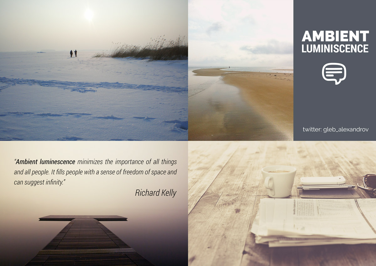
Richard Kelly, one of the pioneers in the architectural lighting, defined Ambient Luminescence as one of the 3 main styles of lighting (alongside with Focal Glow and The Play of Brilliants).
I like his quote so much, that I want to share it with you:
“Ambient Luminescence is a snowy morning in the open country. It is twilight haze on a mountaintop, or a cloudy day on the ocean… Ambient luminescence is the full cyclorama of the open theater and a brilliantly lighted room without visible lights. It is vaporous light and all we can sense of indirect lighting. Ambient luminescence minimizes the importance of all things and all people. It fills people with a sense of freedom of space and can suggest infinity. It is usually reassuring and restful.”
Designing With Light: The Art, Science and Practice of Architectural Lighting Design

Ambient Lighting: Render Flat, Render Without Shadows
Imagine that you make a photo of a gray mossy tree on a cloudy day. The sky dome is your huge softbox. The light wraps around every object and fills in every crevice.
As a result, the light overwhelms the shadows and flattens everything. At a first glance, what is good about such flat lighting?
Here is my list of things that I find interesting about the dullest type of lighting.
1. Living and Breathing Colors

On a neutral backdrop of an overcast day, colors really stand out.
When the light rays hit object from literally every direction with nearly equal strength, we can no longer see form and shape clearly. But what we can see is the diffuse texture and the variations in hue. Pure and vibrant, colors come to foreground. At first thought, it may seem counter intuitive at best.
Nevertheless, it is true.
2. Photo-real Flavor of Unstaged Life
Maybe it’s just me, but I get a strong impression of reality when seeing dull ambient lighting applied to some kind of 3d scenes. You know, we are used to such overpowered theatrical lighting in movies, games and renders, that the calm lighting looks natural and unstaged.
For the example, I’ve recreated this real model in 3d, using photogrammetry. Look how unimpressive is the lighting, yet how obviously natural.
In general, the viewing of photoscanned models reveals the very strong ambient component in lighting.
If you think about it, that’s insane amount of light bouncing. My guess is that our world is powered by a very sophisticated rendering engine, if it can handle such calculations.
3. Conceal the Unwanted

A very soft lighting devours the shapes. Use it to your advantage, when faking geometrical details with texture. Ambient lighting won’t reveal the real shape of your model, so illusion will hold.
In another words, ambient lighting is forgiving to baked textures, faked details and other black wizardry.
4. Ambient Occlusion

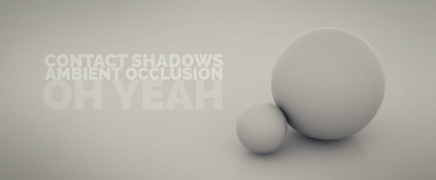
Still, one type of shadows are fully present even in ambient lighting scenario: contact shadows (or ambient occlusion).
In the crevices, or in the places where one surface meets other, we see the contact shadows.
This darkening is a clue that helps us to perceive the depth of the otherwise flat objects.
Bonus tip: to enhance the definition, you can render ambient occlusion as a separate pass and compose it over your picture.
5. Ambient Lighting is A Piece of Cake (Still, the Cake is a Lie)

Nothing, and I mean nothing can come close to ambient lighting in terms of simplicity.
Even saying “duck!” can’t.
At times, setting up this type of lighting consists of only one thing: setting up a gray emissive background. And if you feel fancy, throw in an HDRi. Not a rocket science at all, huh?
LIGHTING BOOK OPEN PROJECT
Friendly reminder: I will publish lighting tutorials in my blog every two weeks (or weekly, if possible). Along with making of’s, work in progress and other exciting stuff, that will go straight to social media, namely Twitter, Facebook and Youtube.
After publishing around 10 articles I’ll start packing it into a book, full of interesting things.

Micro assignment:
Render a couple of spheres using ambient lighting and concentrate on composition and textures. And let’s discuss it!
p.s. Any suggestions on the unique #hashtag for Lighting open project?


James Green
Nice post
Gleb Alexandrov
thnx, James.
Ethan Hansen
#OpenLightBook maybe?
Gleb Alexandrov
Ethan. That’s freaking brilliant!
There is a huge chance that I will use it.
p.s. and in that case, I owe you a beer
Pedro Luchin
Inspiring work, well done.
Gleb Alexandrov
Nice to hear it!
Pingback: Ambient Lighting: Embrace the Dull
Eden S.-G.
Awesome! I often use the AO shader for adding items that the lighting couldn’t possibly support, and for what I use it for it works very well – I know that if I need more control over color I can always use more render layers. Here’s a super quickie:
Gleb Alexandrov
You are absolutely right. AO reveals the crevices and dents really well, especially in case of detailed models.
Pingback: Ambient light vray tutorial | CG Vray & Vision3D
Reinhart Julian
Awesome tutorial , As always! But I have a problem….i dont have a laptop or computer with a decent cpu/gpu, so i use Raypump. But i want to achieve the ao effect where the walls meet the Ceiling. but it cant render the ao pass. Raypump only renders the Beauty pass. What would you recommend tht i do Gleb?
Pingback: 照明/ライティング (Lights) [Blender] – Site-Builder.wiki